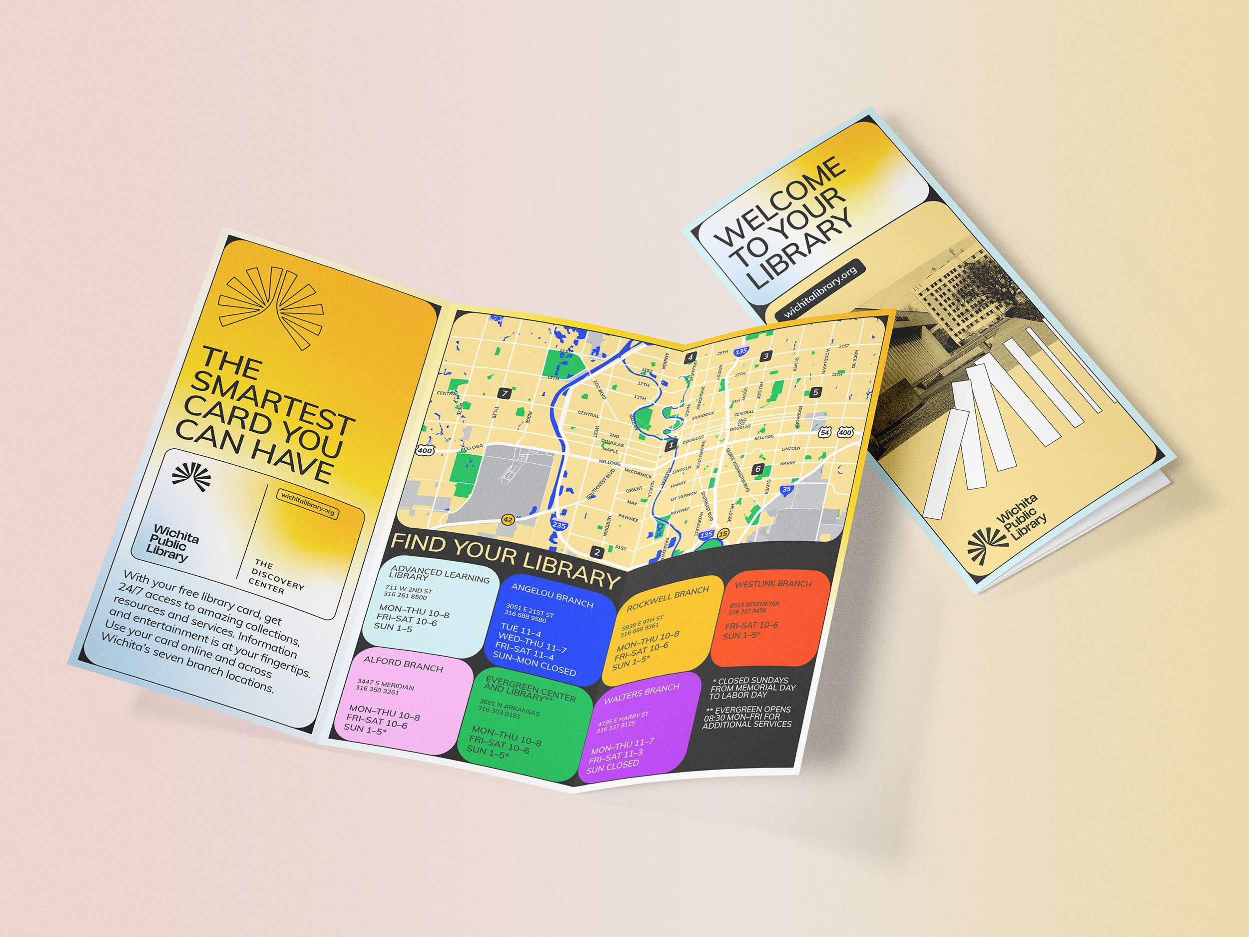
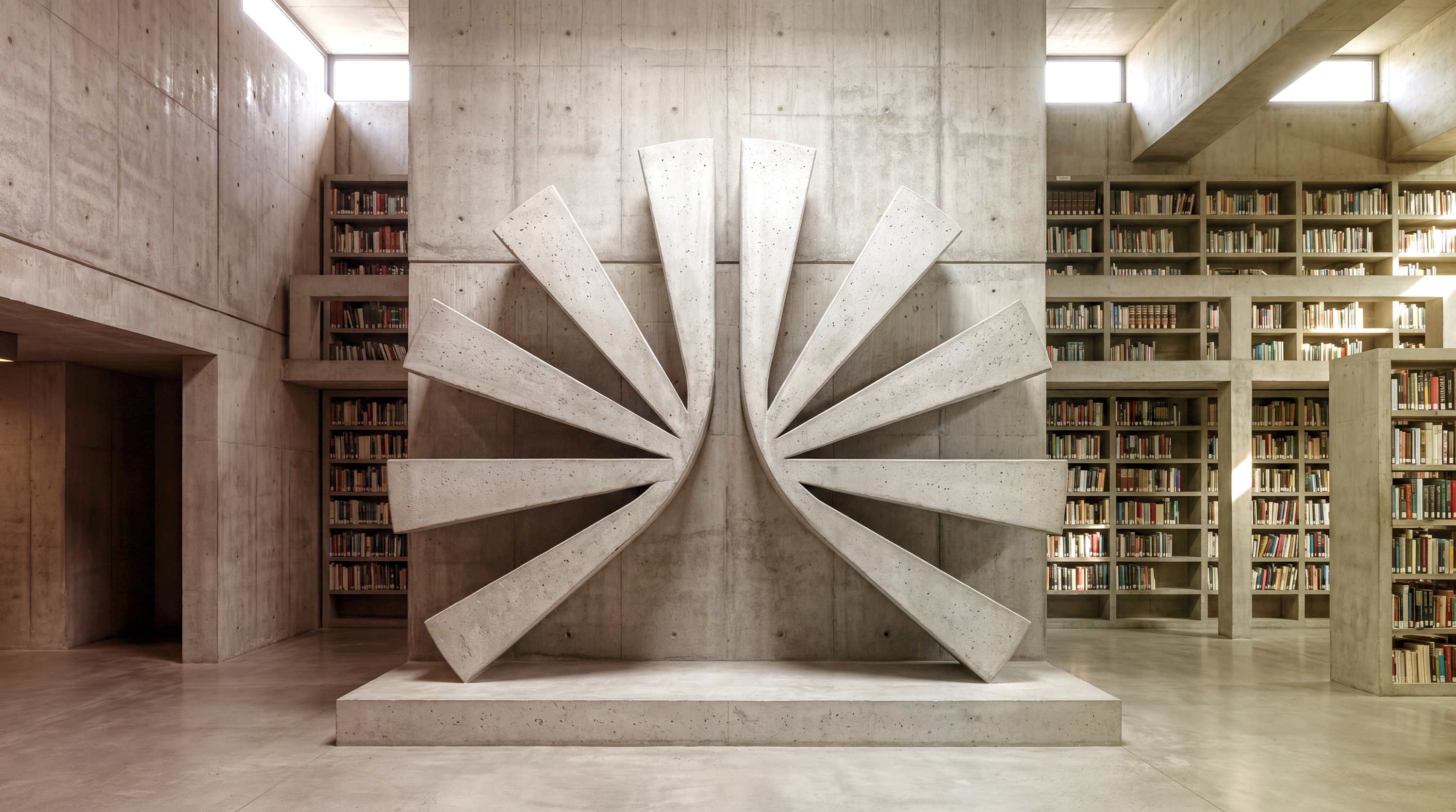
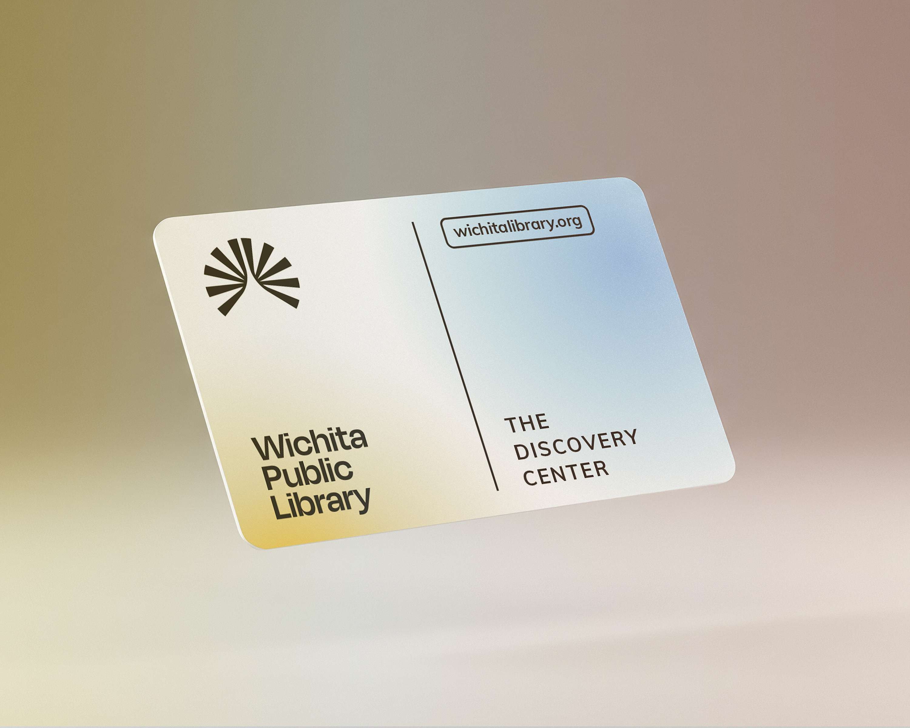
The new mark draws from that architectural language. Radiating forms gather around an open center, suggesting books, light, and access to knowledge. The modular structure extends beyond the symbol, giving the wider system a consistent framework for typography, information, and imagery.
.jpg)
.jpg)
%20copy-compressed%20(1).jpg)
.jpg)