Spectrum Promo

Gardner Design / 2025
Spectrum Promo partnered with Gardner Design to replace an identity that no longer reflected the scale or character of the company it had become. The new system needed to feel energetic and tactile while remaining clear across merchandise, e-commerce, fulfillment, and sales.
The icon folds the color spectrum into a dimensional S. Its wave-like form suggests fabric, banners, and the movement of an idea into the world, while custom lettering extends the same geometry into the wordmark.
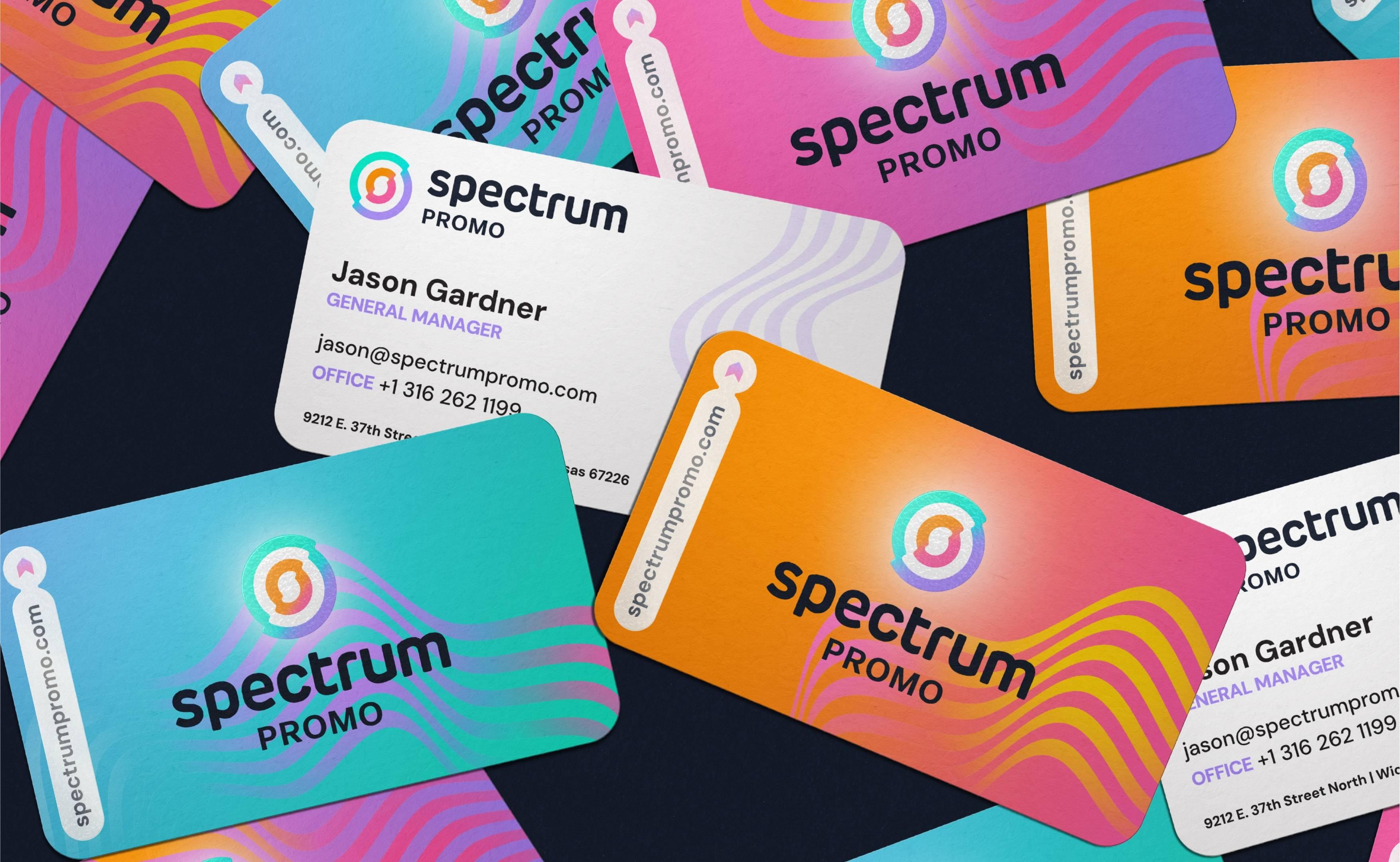
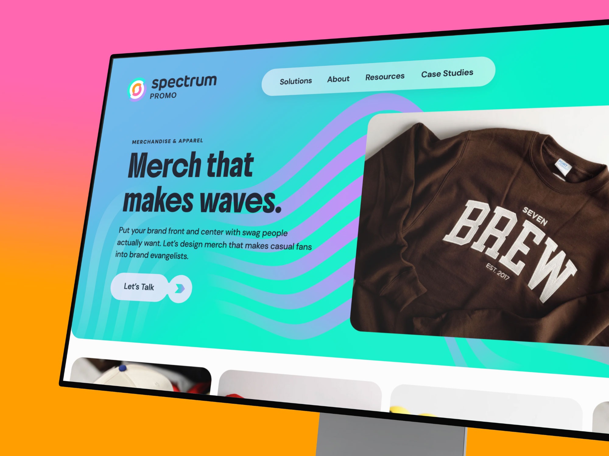
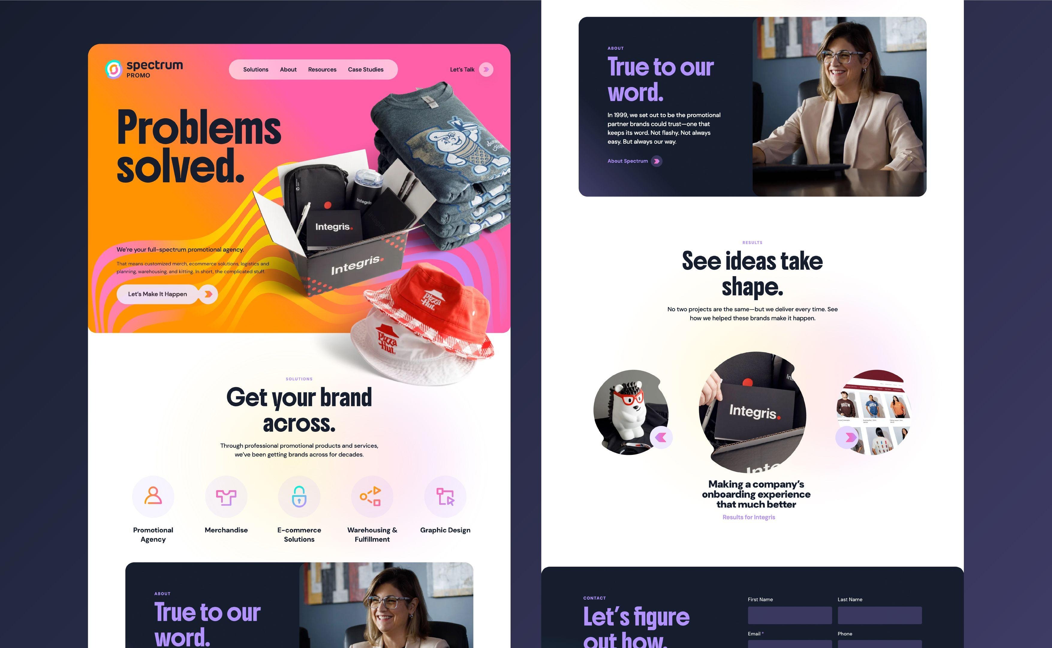
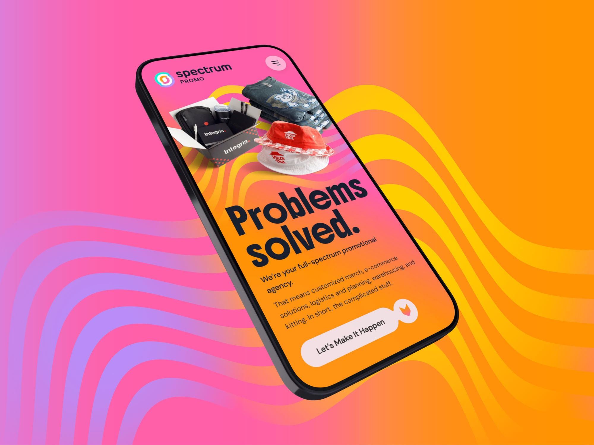
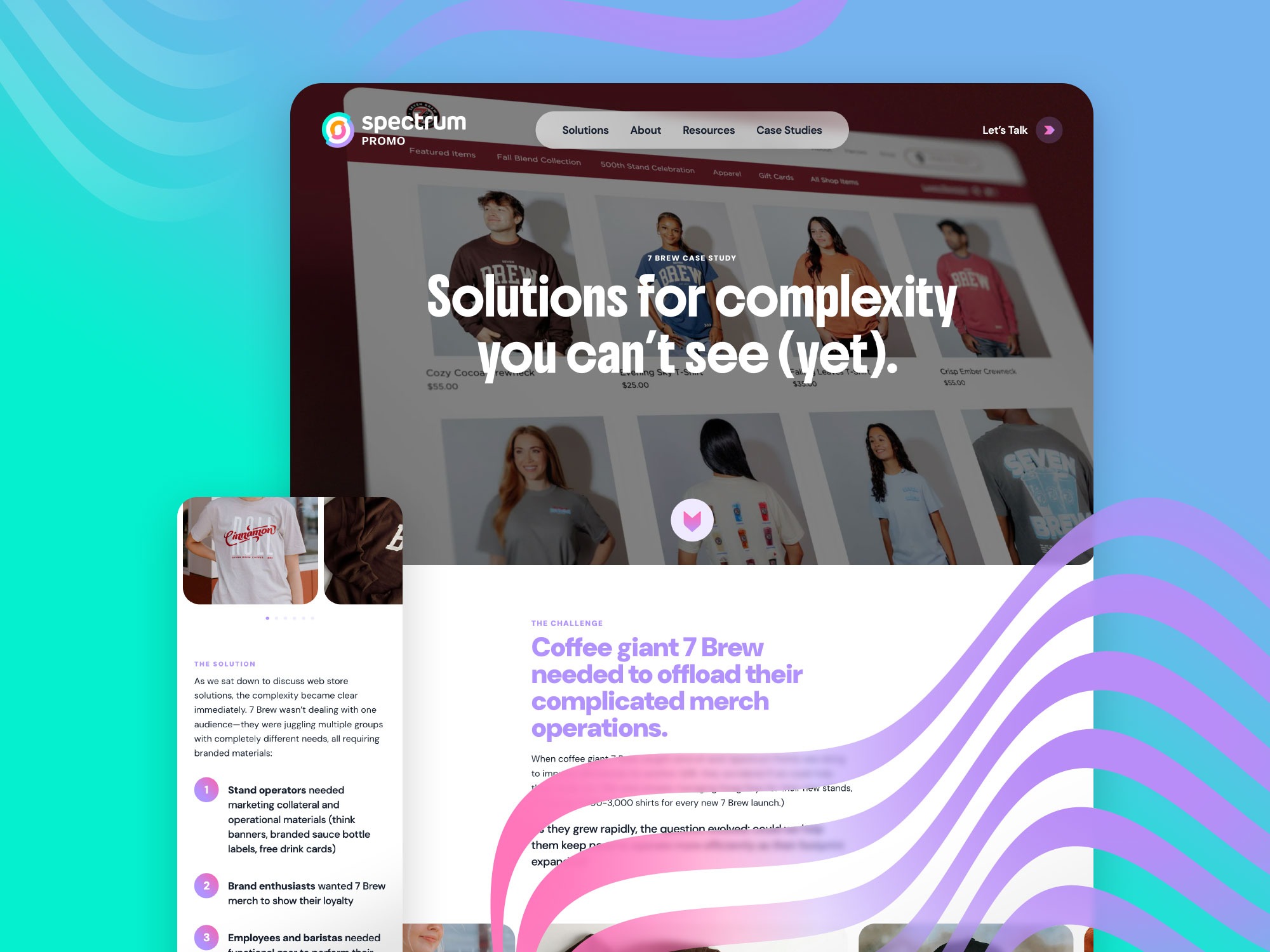
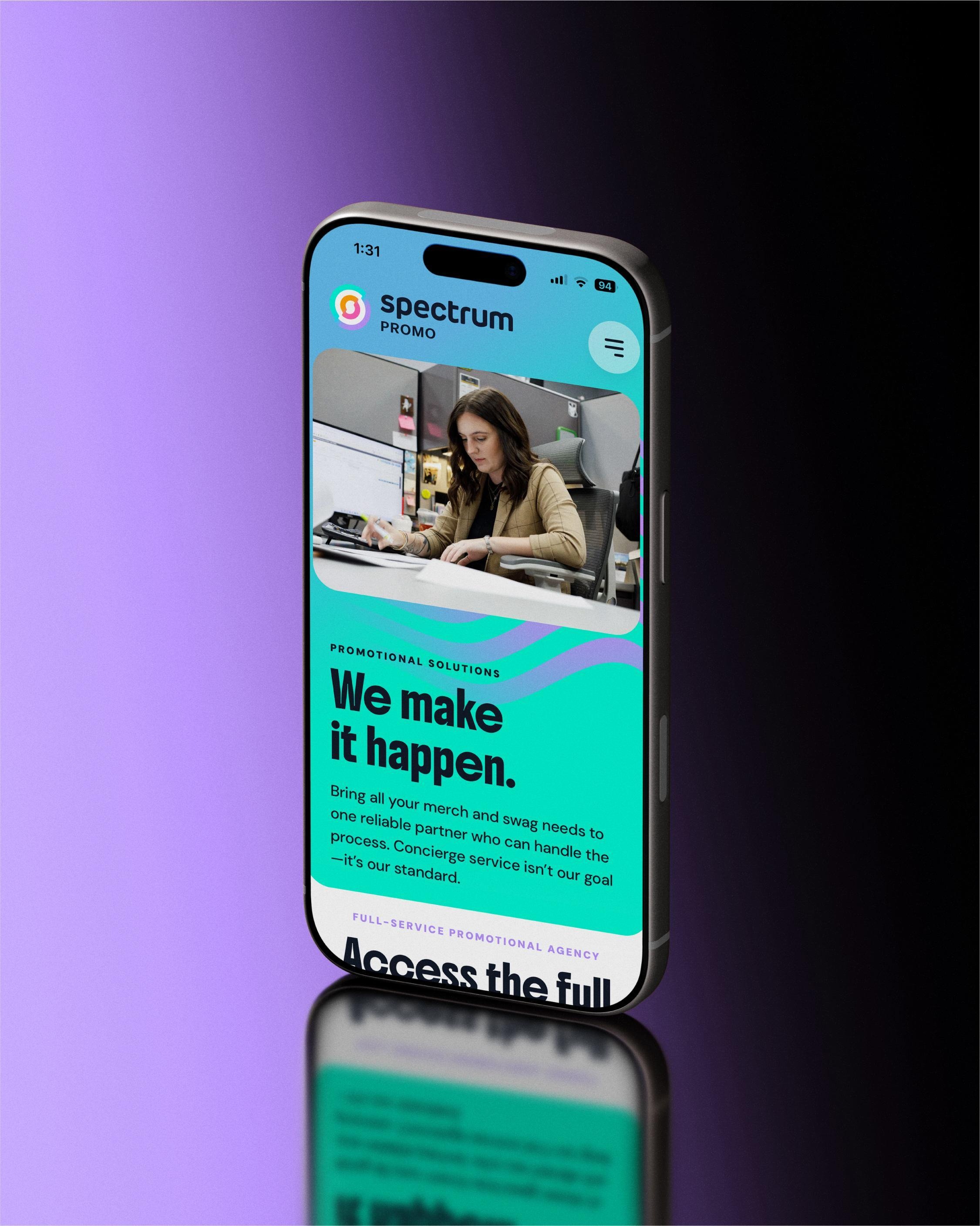
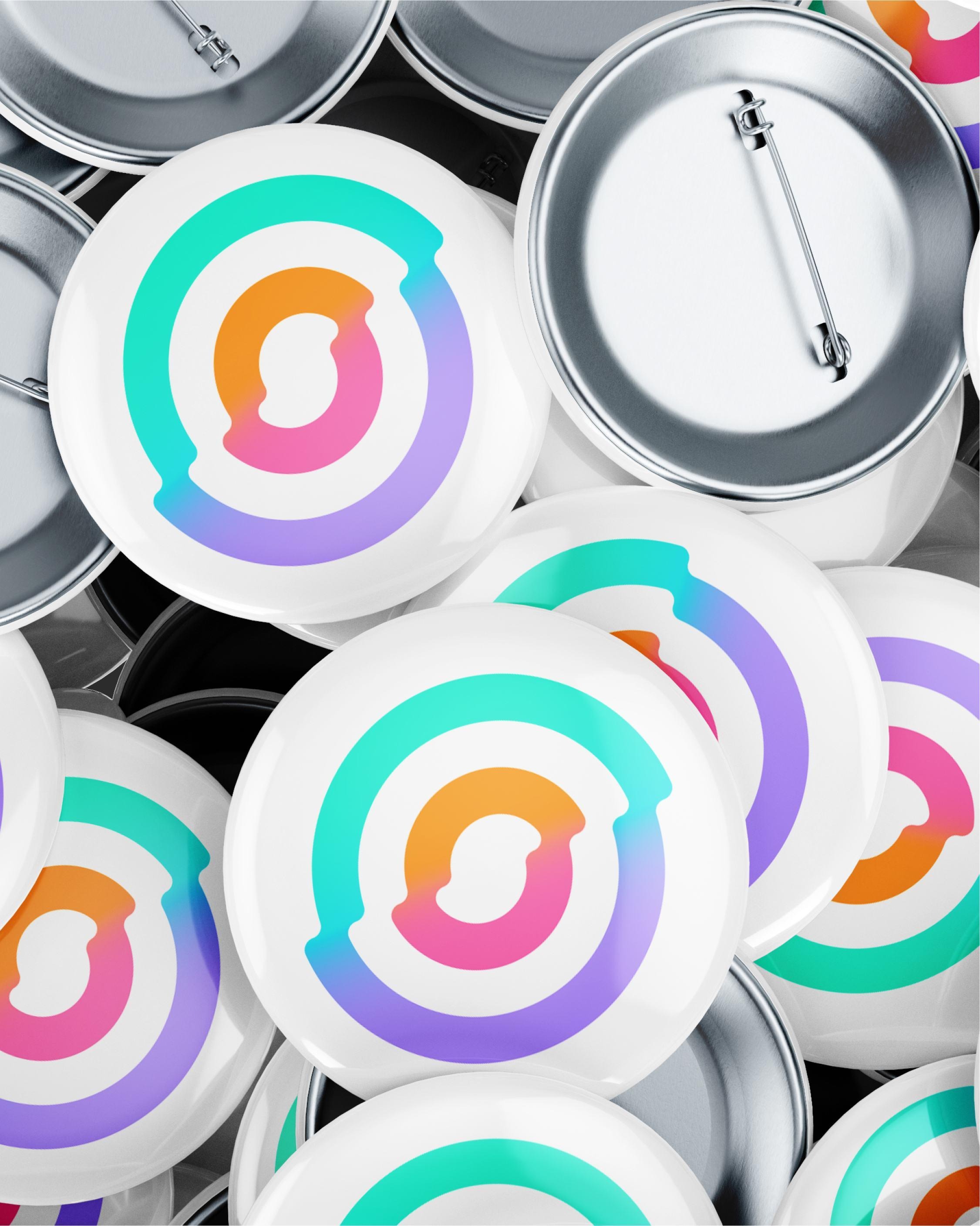
From there, the identity expands into a full-spectrum language of undulating lines, saturated color, and sharp contrast. The system carries across the website, print, packaging, and correspondence, giving varied applications a consistent pulse. Expressive without losing structure, it reflects the immediacy and physical appeal of merchandise while giving Spectrum an energetic, confident presence unmistakably its own.

CREDITS

Creative direction — Bill Gardner
Account + strategy — Toni Gaston
Art direction — Adam Anderson
Digital direction — Jay Walter
Design — Tyler Frisbee
Development — Krista Flying Out
Copywriting — Jayna Hill
Photography — Gavin Peters